


Centering Non-Full-Width Columns in Beaver Builder
Did you know you can set a column width in Beaver Builder to less than 100%? By default, though, these narrower columns align to the left, which might not always look ideal. With a simple tweak using the code below, you can ensure your columns are perfectly centered.
Why Use This Setting?
Sometimes, having elements stretch across the full width of the screen isn’t the best choice. For example:
- Long text blocks can be harder to read when they span the entire width.
- Images or other content might look more balanced and visually appealing at 60% width or less.
By centering these columns, you can create a more polished and aesthetically pleasing layout while improving readability and focus. Check out the code snippet below to achieve this effect and elevate your designs in Beaver Builder!
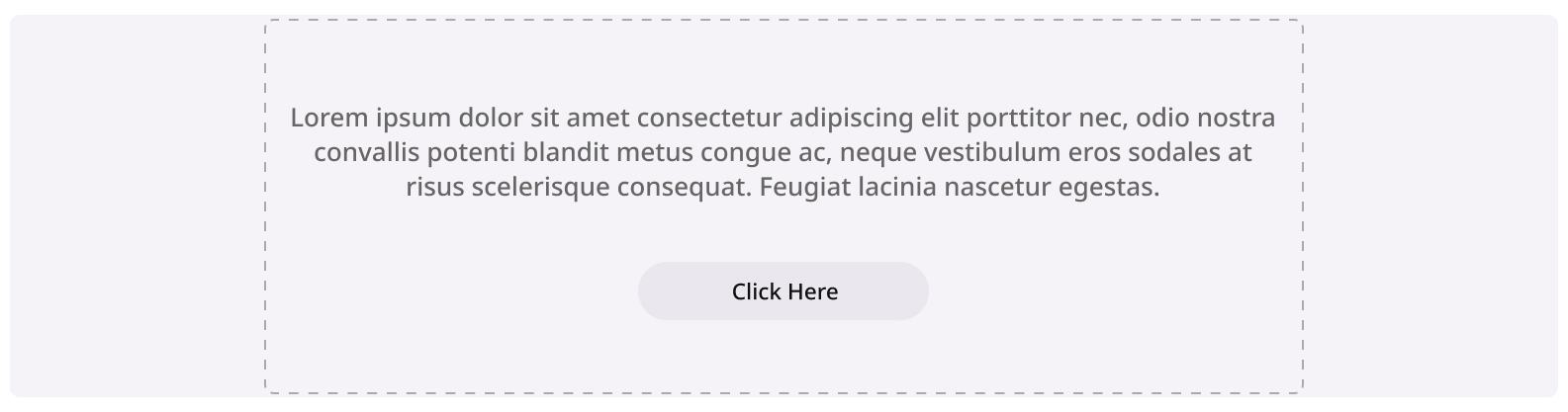
The Result
Go to Column > Column Settings > Advanced Tab > Give your Column a Class like I did here called sld-center-col > Save.
Then go to the Customizer and paste the code in there!
The Code
.sm-center-col.fl-col{
    margin-left: auto;
    margin-right: auto;
    float: none;
}
If you want this to only work on a certain size, try adding a mobile query like the below.
@media screen and (max-width: 768px) {
	.sm-center-col.fl-col{
		margin-left: auto;
		margin-right: auto;
		float: none;
	}
}